Let’s begin with that weird word
Choropleth
If you never tried to plot those colored maps, it’s likely you never used that word.
Interestingly, it originates from Greek, where Choros translates to "area," and Plethos signifies "multitude." Consequently, choropleth maps are visual representations of data across geographic zones, with each zone uniquely colored to reflect the associated information.
Creating an effective choropleth map requires a thorough grasp of how color influences a reader's interpretation of data.
To initiate this discussion, let's first delve into the basics of working with choropleth maps.
What is a Choropleth Map
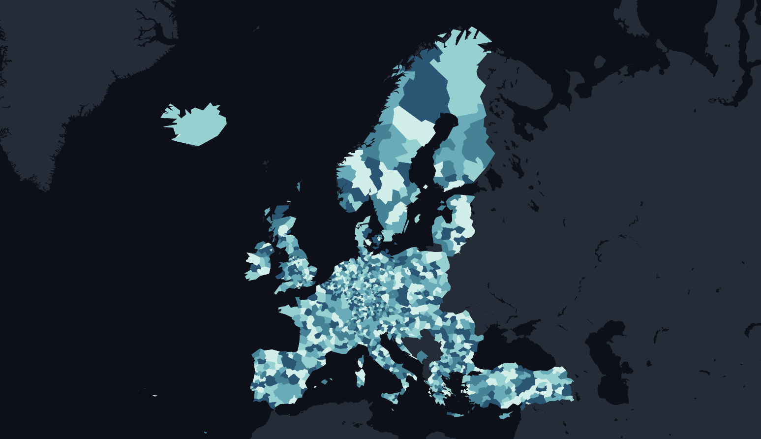
A choropleth map is a type of thematic map that visualizes spatial data by using different shades or colors to represent variations in the intensity of a phenomenon across different geographic areas, such as regions, countries, or districts.
The variations in color or shading on the map correspond to the values of the data being represented.
Choropleth maps are commonly used to illustrate statistical data, making it easier to identify spatial patterns and trends.
The geographic areas on the map are often shaded based on a gradient or scale, with darker or more intense colors representing higher values of the variable being mapped, and lighter colors representing lower values.
These maps are particularly useful for depicting regional differences in data, such as population density, income levels, election results, or any other quantitative information that can be categorized by geographic boundaries.
Choropleth maps provide a quick and effective way to communicate spatial patterns and variations in data across different regions.
Choosing Palette Type
One of the most important decisions you’ll make when designing a choropleth map is to select the type of palette.
You’re not simply choosing a color, but the arrangement of colors to help readers correctly interpret your information. The rule is straightforward: choose an appropriate color palette that matches your data format, and the story you wish to tell.
Color palettes are typically grouped into three types — sequential, diverging, and qualitative.

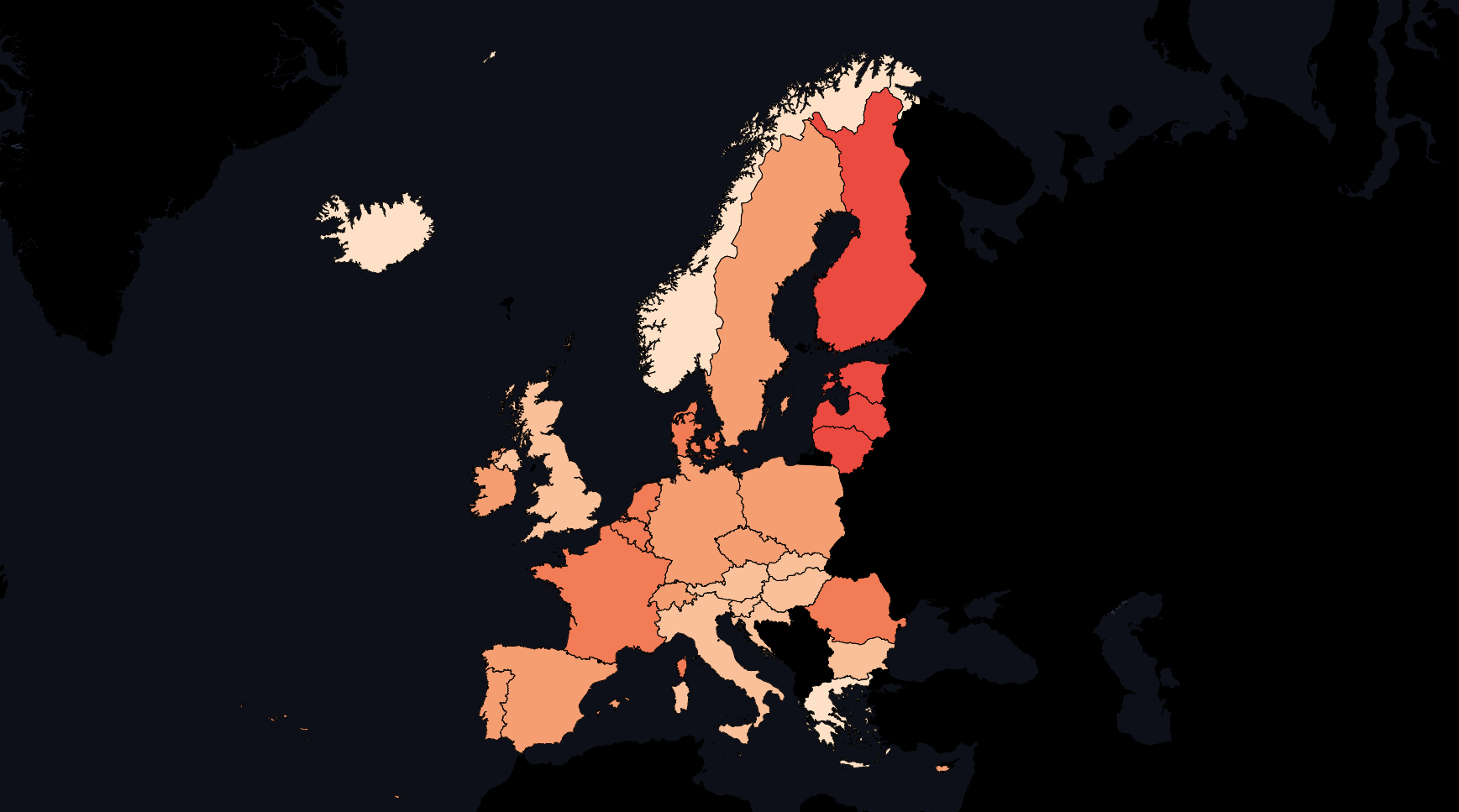
Sequential palettes
The most basic guidance for color use on maps is to use lightness to represent ordered data.
Ordered data may be numerical data or ranked data.
For example, two city populations are ordered whether listed as “50,000 and 650,000 people” or simply as “small and medium sized.”
Generally, darker colors are used to represent higher data values, and lighter colors represent lower values.
Sequential color palettes may include hue variation, but they should rely most on variations in lightness.
The color palettes shown here are from Atlas, a web-based GIS application that can guide you in selecting map colors.

Diverging palettes
Diverging palettes work best to show numeric values above and below a standard level (such as zero, the average, or the median).
They typically have two distinct hues to represent positive and negative directions, with darker colors at the extremes, and a neutral color in the middle.
Examples include income above or below the median level, rainfall above or below seasonal average, or percentage of voters above or below the norm.

Qualitative palettes
Qualitative palettes represent different kinds of map features or categories that are not ordered.
Categorical differences in data are usually represented with differences in hue.
For example, types of government spending, such as education and healthcare, are categories that could be shown with unique hues like red, green, and blue.
A well-designed qualitative scheme will not suggest that data is ordered or that one category is erroneously more important than another.

Choosing Steps and Scale Method
Steps and scale method determine how you group and display data on your choropleth map.
The number of steps mean how many colors that is used to color the data, while the scaling method determines how these steps are distributed across the data values.
The number of steps should be based on the data you want to visualize.
Fewer steps create a coarse map that highlights broad differences, while more steps create a granular map that emphasizes geographic diversity between areas.
I recommend you to experiment with the number of steps and see in the map how the data is visualized.

The most common scale methods:
- Quantize places your data values in a straight line, from lowest to highest. This method works best when the data are evenly distributed, or if you wish to draw attention to the low and high extremes in your data, since they will stand out in light and dark colors.
- Quantile divide your data values into groups of an equal number. More specifically, quartiles, quintiles, and deciles divide the values into four, five, or ten groups of equal quantity. This method works best when the data are skewed to one side, because the regrouping allows you to draw attention to diversity inside the data, rather than the extremes. Rounded values are similar to quantiles, but the decimals are replaced with rounded numbers that look nicer to readers’ eyes.
- Natural breaks (Jenks) offers a compromise between quantize and quantile methods. It groups data values that are close together, but maximizes differences with other groups. This method may work best with skewed data where you wish to draw attention to both internal diversity and extremes.
Which scale method is best?
There are no uniform design rules, except that I advise against using Custom settings to manually place color intervals wherever you wish, since they are more likely to create misleading maps. You should always look at the raw data and choose an appropriate scale method to fit the data.
Creating Color Palettes
There are many helpful tools and community sites for creating color schemes! A few are listed below.
- ColorBrewer
- chroma.js by Gregor Aisch and its helper tool
- Colorpicker based on chroma.js
- Adobe Color CC
- color-hex popular palettes
- COLOURlovers
Prefer not to create your own color palettes? Atlas offers more than 30 ready-to-use, high-quality color palettes for you to use.